ion-item
项目(Item)是可以包含文本、图标、头像、图像、输入以及任何其他原生或自定义元素的元素。项目只应作为列表中的行与其他项目一起使用。项目可以进行滑动、删除、重新排序、编辑等操作。
基本用法
项目左对齐文本��,当文本比项目宽时自动换行。我们可以使用 Ionic 框架提供的 CSS 工具来修改此行为,例如在下面的示例中使用 .ion-text-nowrap。请参阅CSS 工具文档了解可以添加到项目以转换文本的更多类。
内容类型
虽然列表中的项目有多种形式,但它们通常支持 5 种不同的内容类型:辅助视觉元素、文本、元数据、操作和控件。但是,并非所有这些内容类型都应同时使用。以下指南展示了不同的内容类型以及如何在应用中正确使用它们。
辅助视觉元素
辅助视觉元素是项目的装饰性图标或其他装饰。常见的辅助视觉元素示例包括头像、图标和缩略图。由于这些内容不是理解项目意图所必需的,因此通常会使用 aria-hidden="true" 对屏幕阅读器隐藏。
如果视觉元素需要与项目交互(如图标按钮),则该视觉元素是操作而不是辅助视觉元素。
辅助视觉元素应以一致的方式渲染。这使每个项目中的信息更易于解析。
在列表中将对齐视觉元素放在同一侧
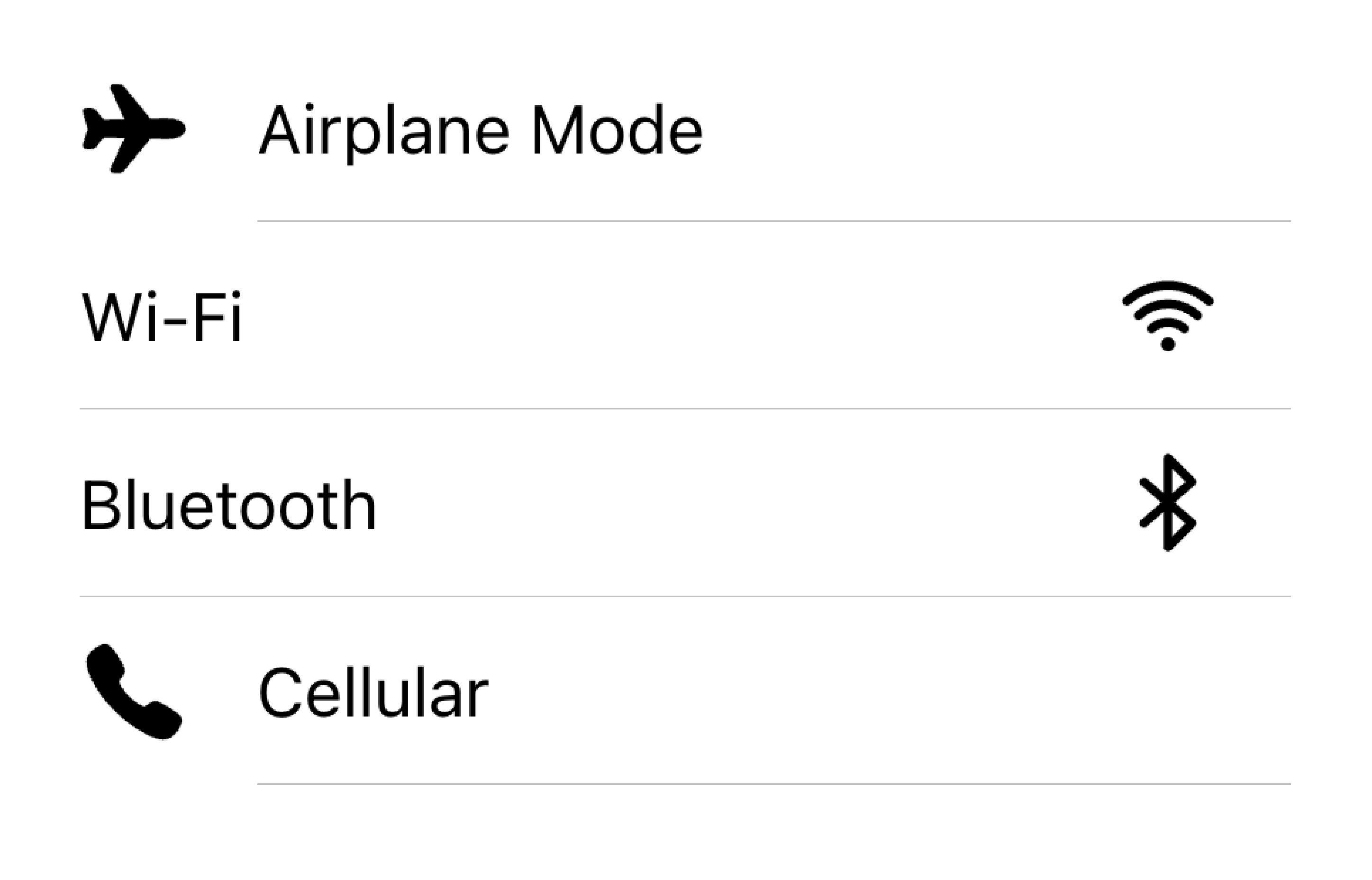
不要在同一个列表中以不同的对齐方式渲染视觉元素
在下面的示例中,我们创建了两个带有辅助视觉元素的列表。第一个列表使用图标,第二个列表使用头像。视觉元素是装饰性的,因此它们都有 aria-hidden="true"。此外,它们一致地呈现在 start 插槽中。
文本
文本内容类型包括表单控件标签或其他可见文本。此文本用于指示项目的用途。尽量保持文本简短明了。
如果你发现需要再多写几句话来说明项目的用途,请考虑将额外的句子移到列表底部的注释(Note)中。将项目放在自己的列表中可以清楚地显示文本与哪个项目相关联。
将长文本移到列表外部
不要试图在项目中放置长文本
在下面的示例中,我们创建了一个包含不同类型文本的列表。"First Name"和"Last Name"标签用于指示在文本输入框中输入什么内容。
切换开关上的"Allow Notifications"标签下方有额外的文本,说明用户可以禁用通知。由于这段文本很短,所以放在项目内部。
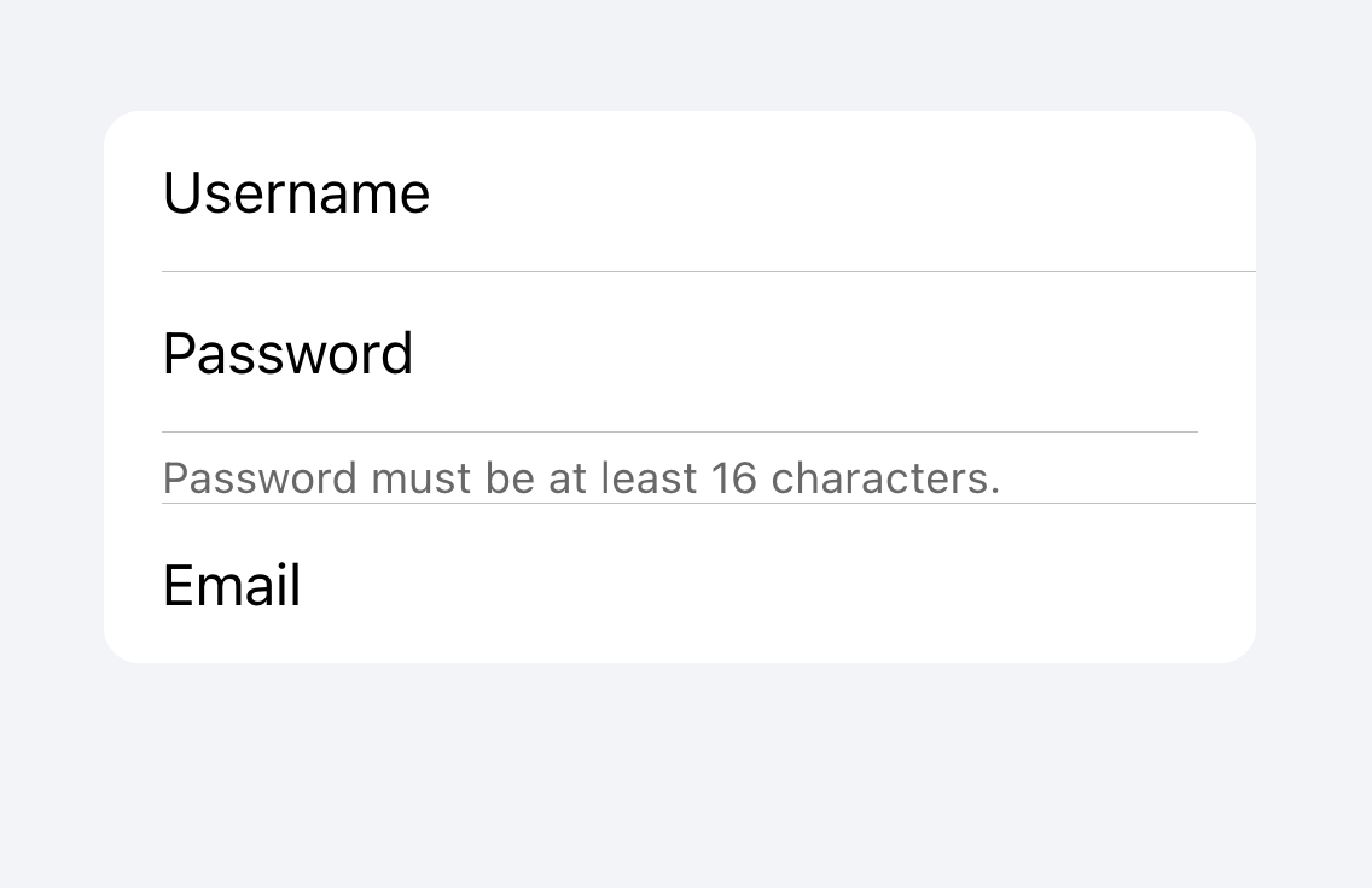
该列表下方是另一个列表,其中包含一个 textarea,下方有包含长文本的注释(Note)。textarea 被放在自己的列表中,以清楚地表明长文本与 textarea 相关联,而不是其他字段。
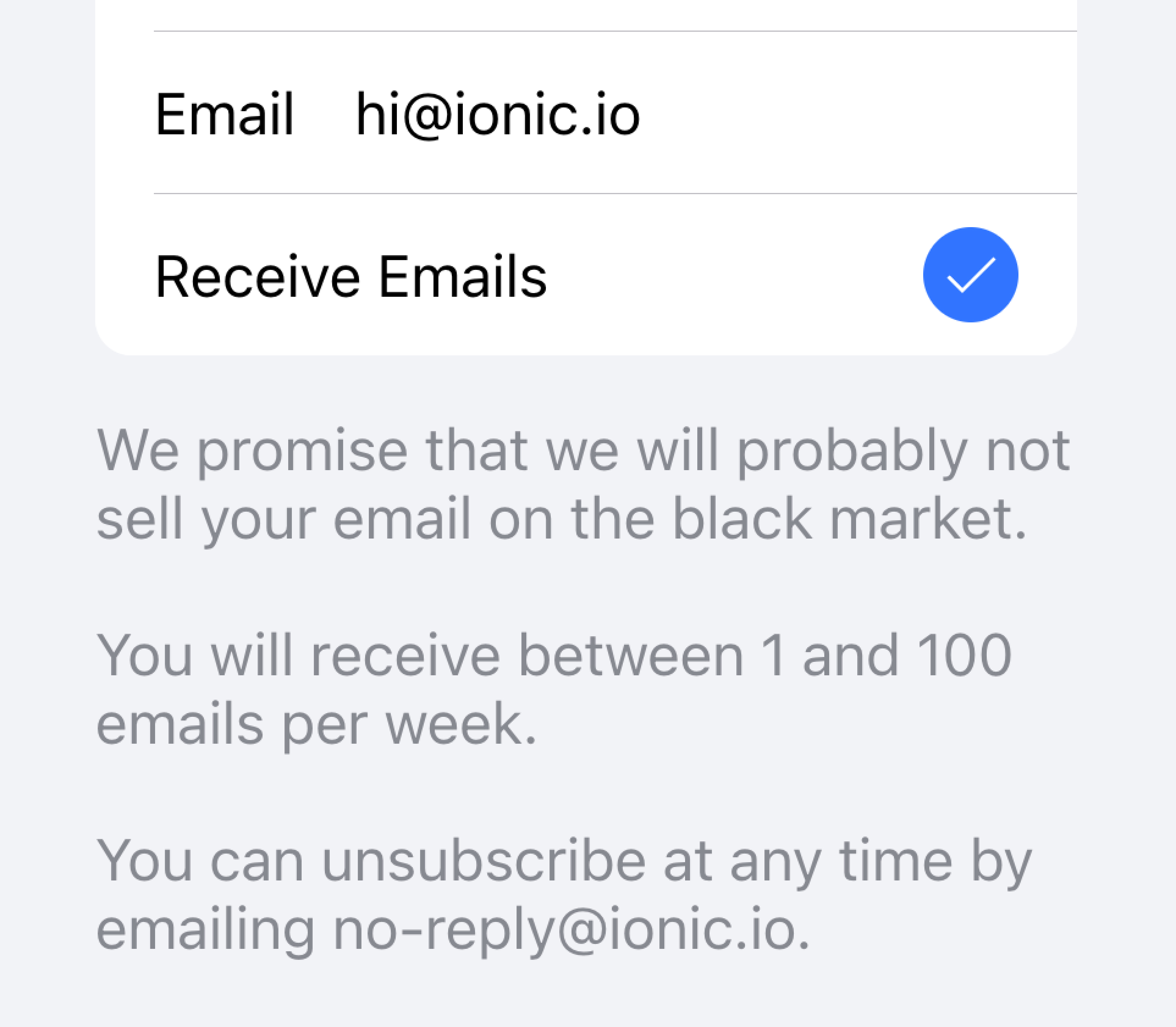
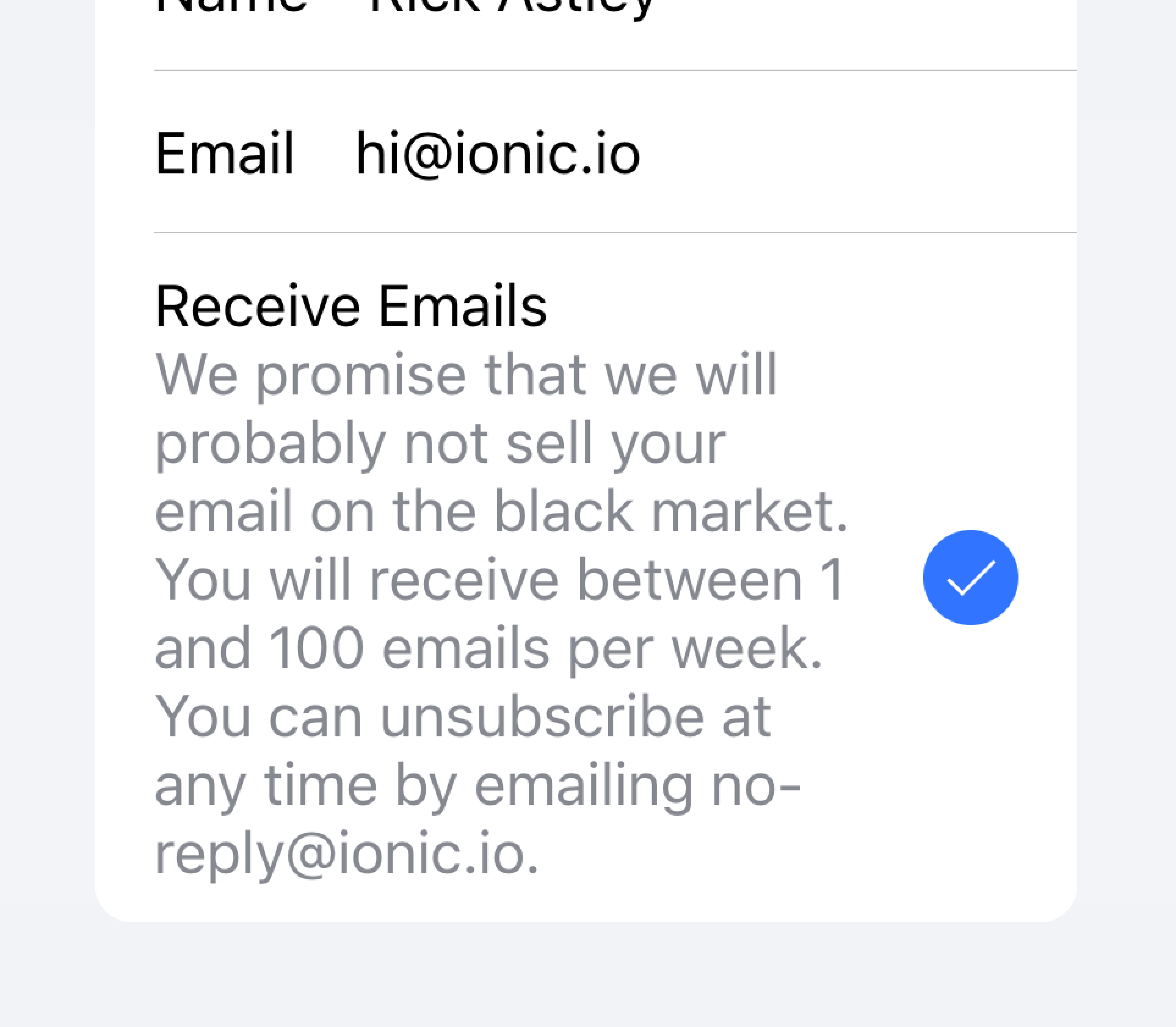
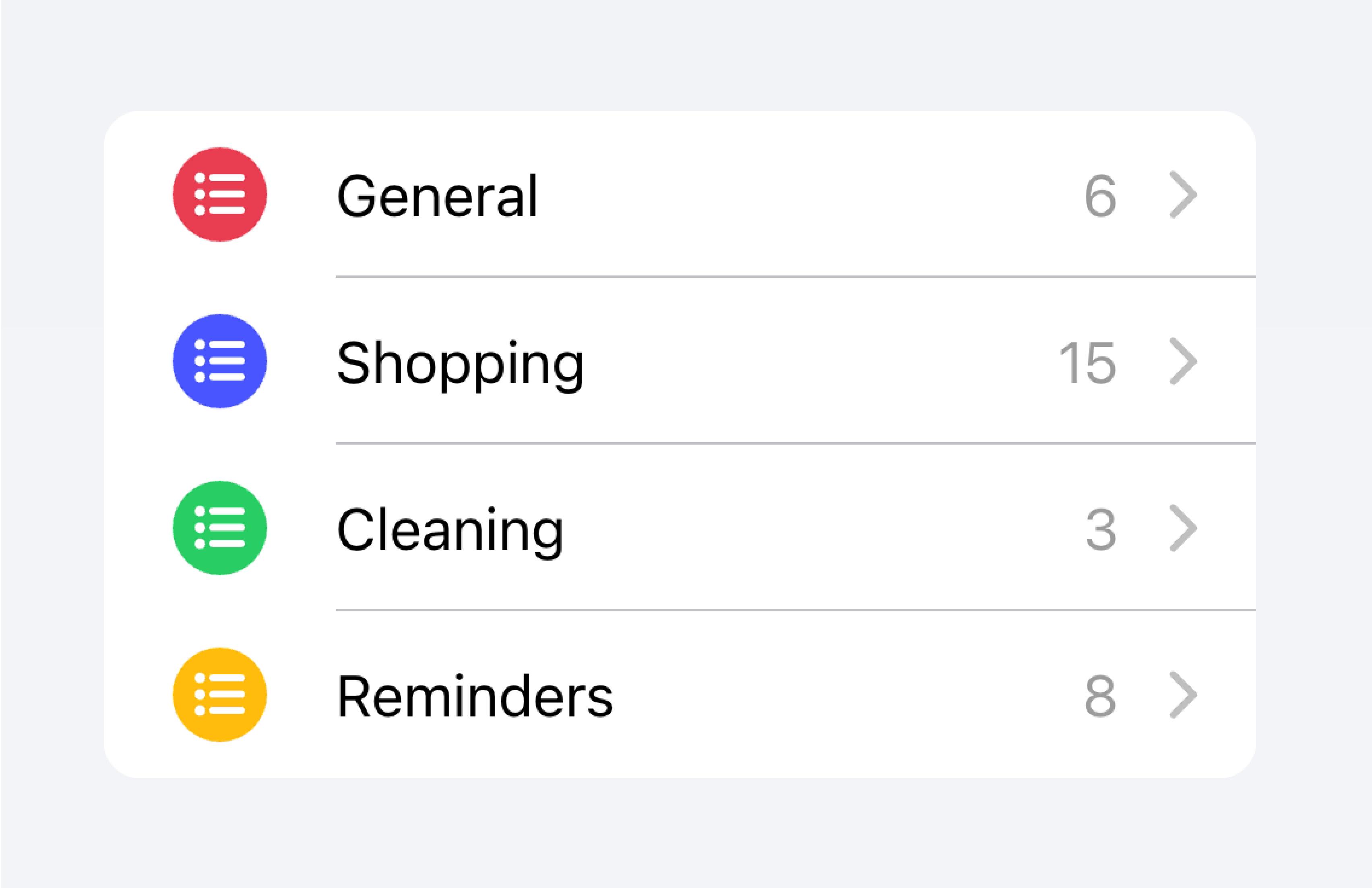
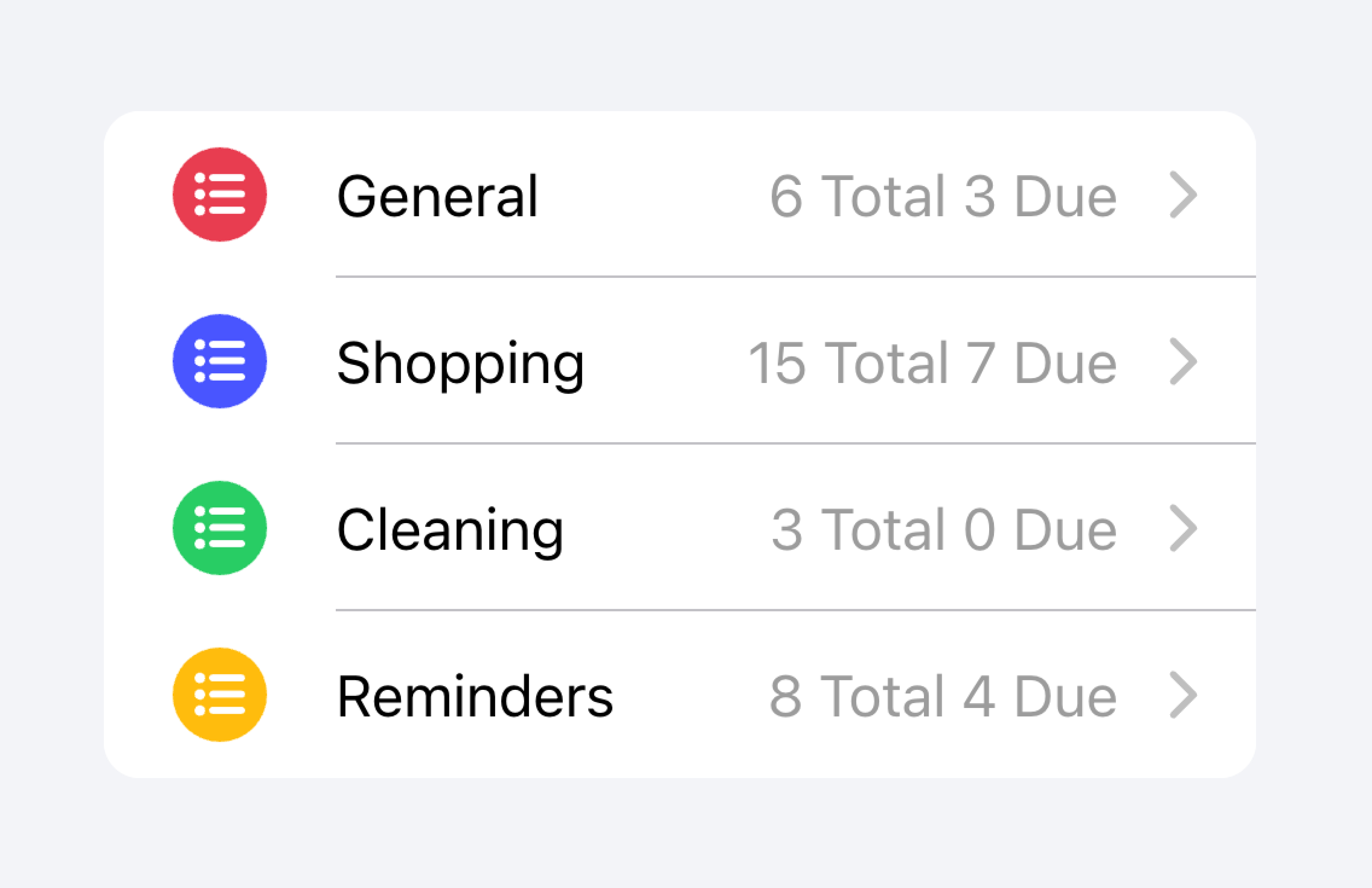
元数据
元数据为项目提供额外的上下文,例如状态文本或计数。像徽章(Badge)或注释(Note)这样的组件是显示元数据的好方法。
限制你包含的元数据量,只包含最相关的信息。
只添加最重要的元数据
不要添加太多元数据,这可能会让用户不知所措或感到困惑。
开发者还应该考虑元数据的重要性。吸引用户注意元数据可能对用户有帮助,也可能分散他们对更重要信息的注意力,具体取决于用例。
优先展示最重要的内容。
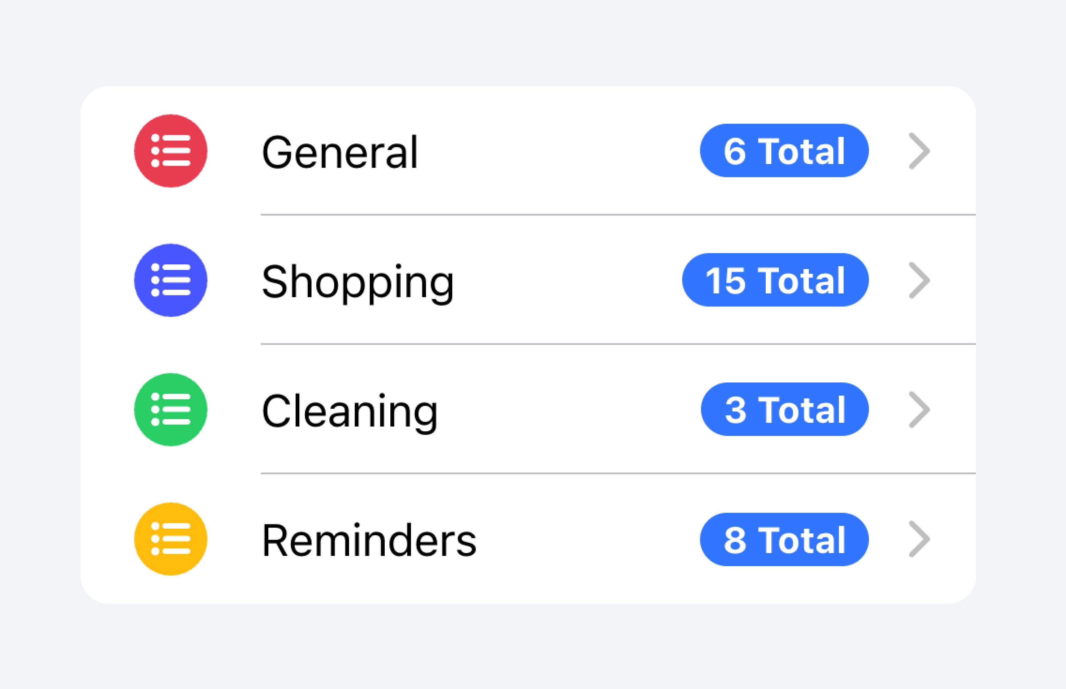
优先显示的元数据可能会分散用户对其他重要内容的注意力。
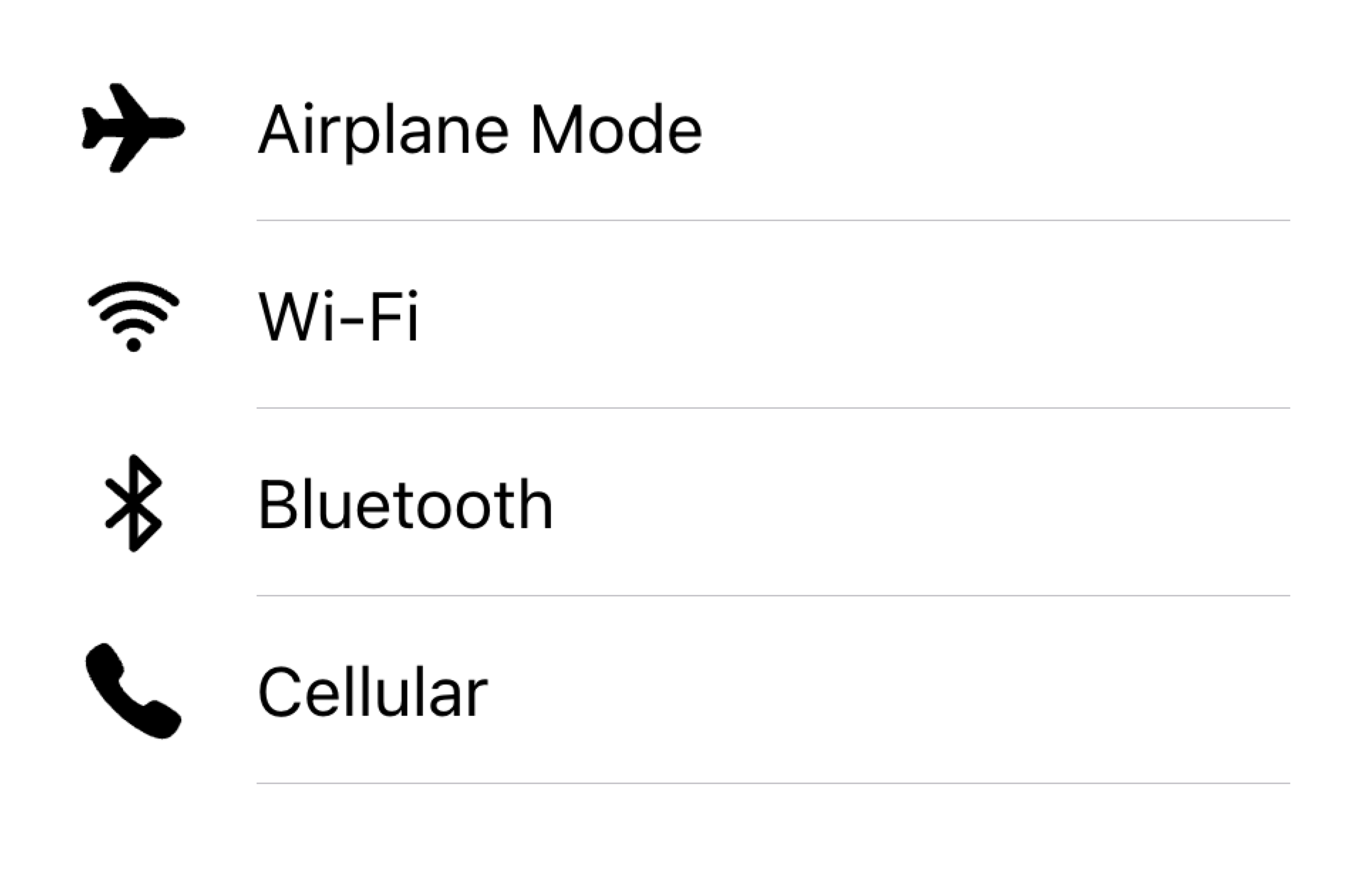
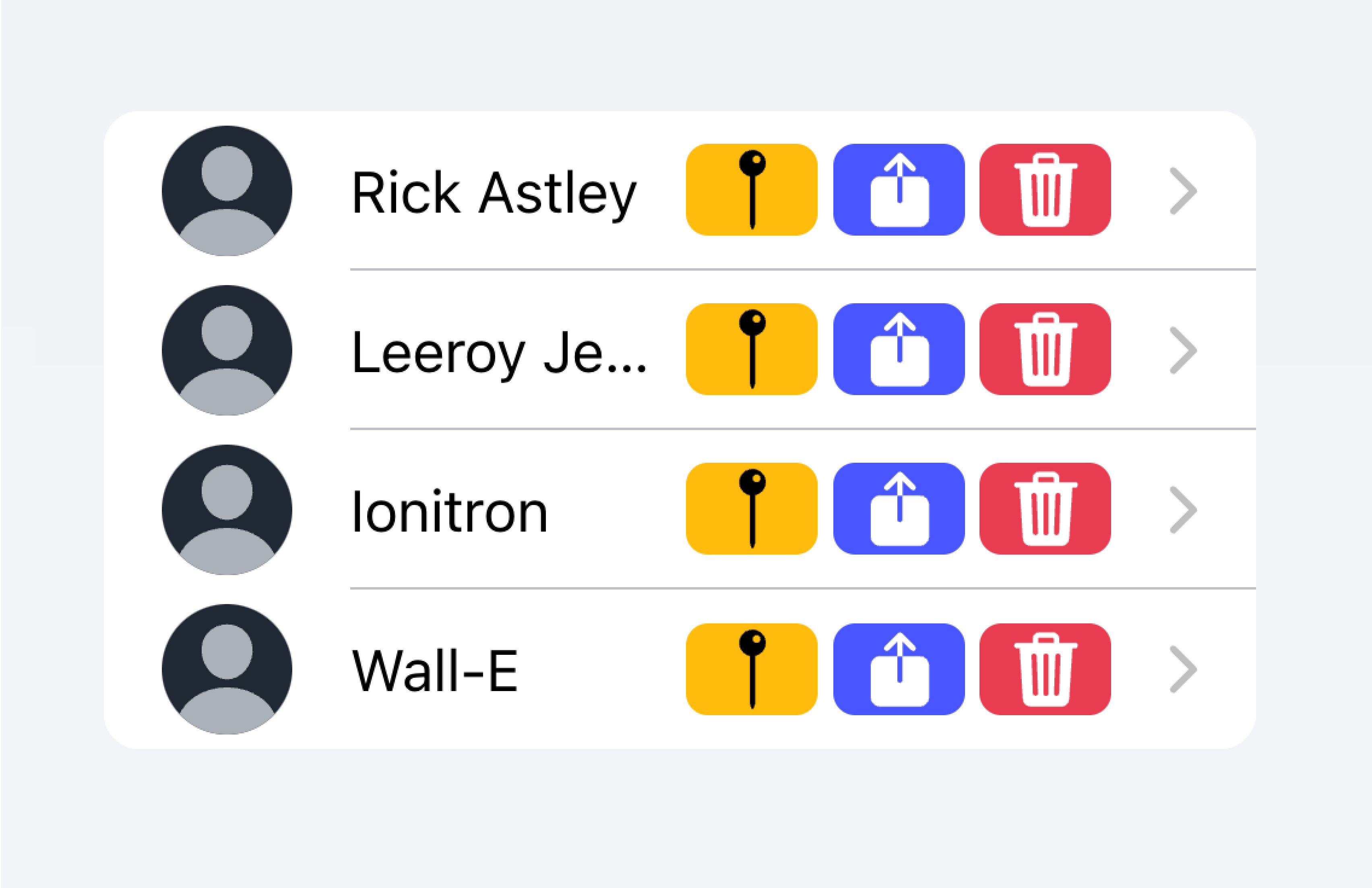
在下面的示例中,我们创建了两个带有不同类型元数据的列表。第一个列表使用注释(Note)来显示每个待办事项列表中有多少个任务。
第二个列表模仿 iOS Mail 应用程序显示收件箱。这个列表使用了自定义元数据,包括"start"插槽中的"未读消息"指示器,以及"end"插槽中的时间戳和自定义详细信息图标。"未读消息"指示器以蓝色高亮显示,以吸引用户注意未读消息,而时间戳则更为微妙。
操作
操作是交互式元素,激活时会执行某些操作。一个项目可以在同一行上显示多个操作。但是,开发者应确保每个操作的点击目标足够大以便使用。
开发者应避免创建可能破坏屏幕阅读器用户体验的嵌套交互元素。例如,如果 button 属性设置为 true,开发者应避免在项目主要内容内部添加按钮。
操作可以通过使用项目滑动(Item Sliding)组件来添加。操作也可以直接放置在项目内部而不使用项目滑动,但这应限制在不超过 2 个操作。
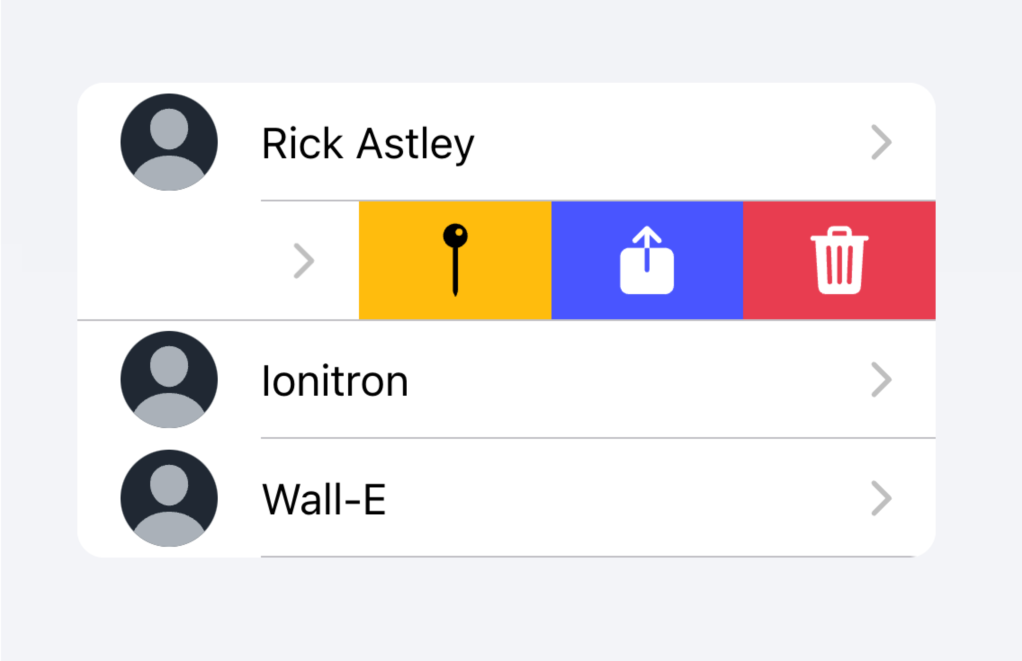
使用项目滑动(Item Sliding)通过滑动项目来显示多个操作。
不要在项目内放置超过 2 个操作。
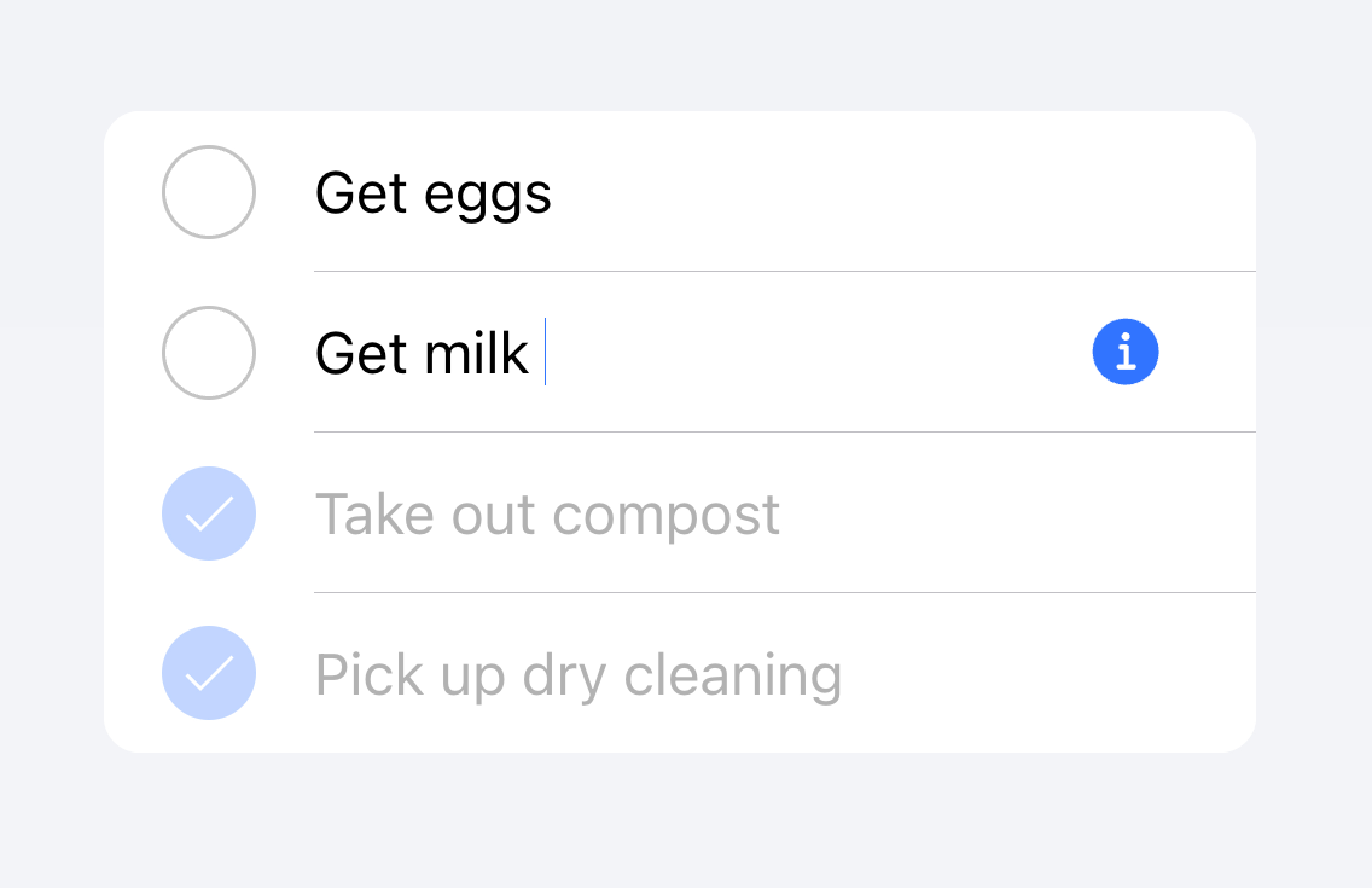
在下面的示例中,我们创建了一个联系人列表。每个项目是一个存根按钮,旨在带你进入该项目的完整联系人页面。每个项目还有额外的关联操作,用户可以通过滑动项目来显示。
控件
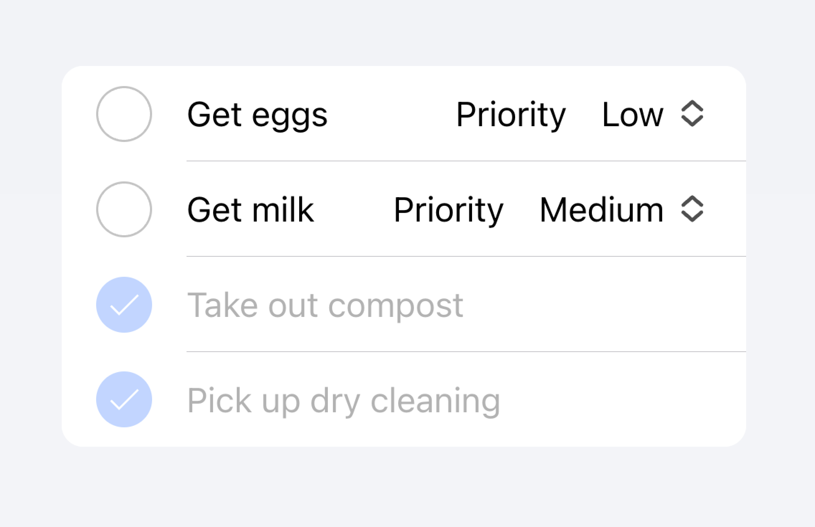
控件是表单组件,如复选框、输入、单选按钮等。由于屏幕空间限制,列表中的每个项目最多应有 2 个控件。
列表视图中的表单控件不应使用帮助文本或字符计数等元数据。如果需要此类元数据,表单控件应放置在列表外部。填充输入(Filled Inputs)是在列表外部可视化定义输入容器的好方法。
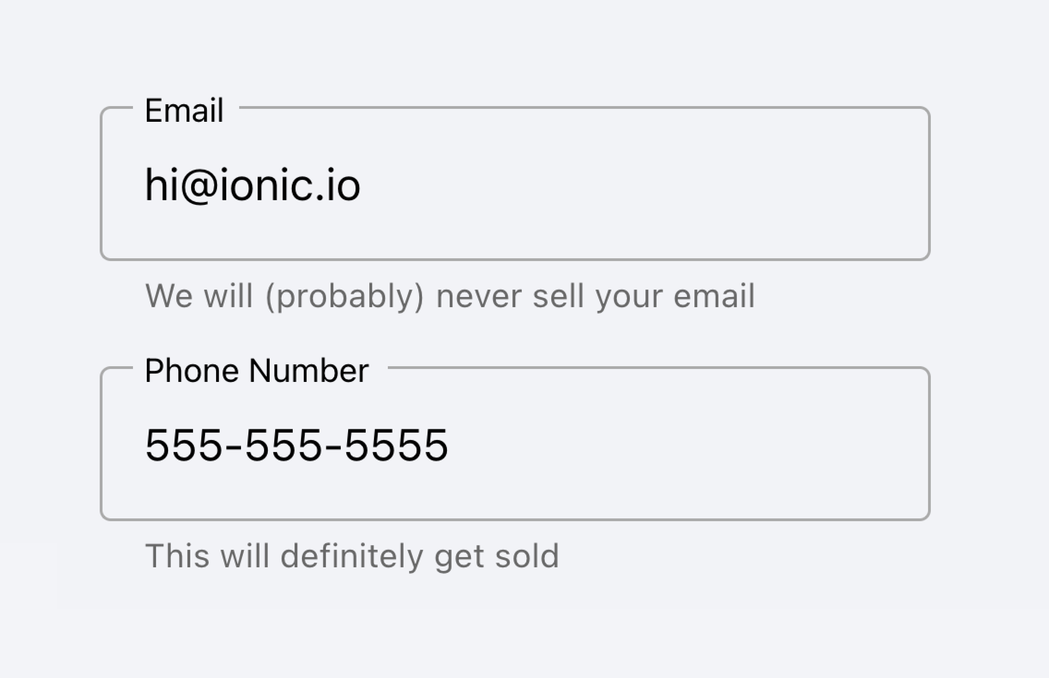
将带有元数据的输入放在列表外部。
不要将输入的元数据放在列表中。
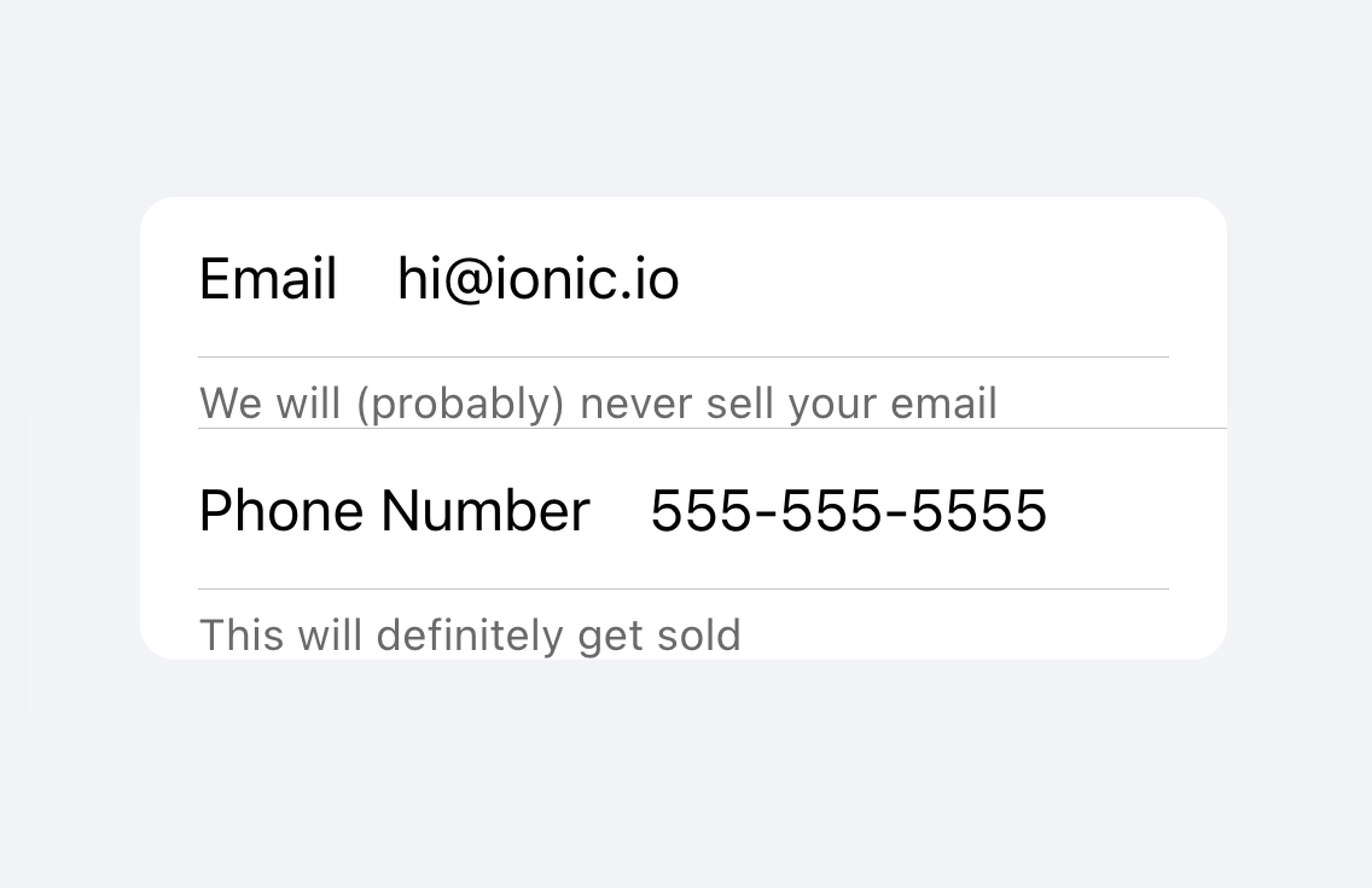
或者,可以将元数据放在列表底部的注释(Note)中。
将输入的元数据放在列表末尾。
不要将输入的元数据放在列表中。
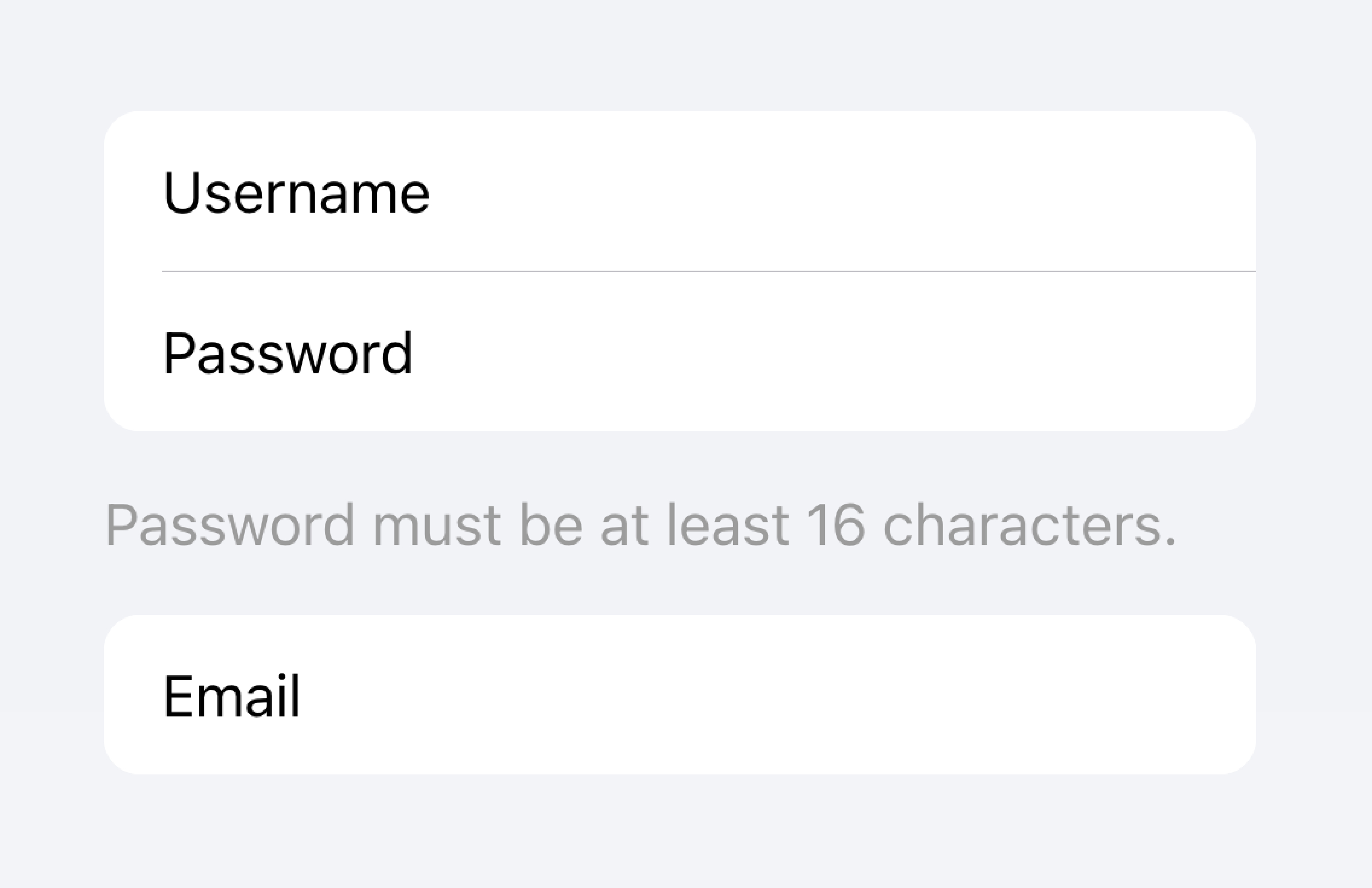
项目通常不应超过两个控件。如果需要更多控件,请考虑在可从项目访问的模态框(Modal)中添加额外的控件。
将额外的控件移到可从项目访问的子菜单中。
不要在项目中使用超过两个控件。
在下面的示例中,我们创建了一个待办任务列表。每个项目有一个复选框和一个输入。复选框让用户将任务标记为完成,输入让用户更改任务的名称。
可点击项目
如果项目设置了 href 或 button 属性,则视为"可点击"。可点击项目有一些视觉差异,表明它们可以进行交互。例如,可点击项目在 md 模式下激活时会呈现涟漪效果,在 ios 模式下激活时会有高亮效果,并且在 ios 模式下默认有详细信息箭头。
详细信息箭头
默认情况下,可点击项目在 ios 模式下会显示右箭头图标。要在可点击元素上隐藏右箭头图标,请将 detail 属性设置为 false。要在不会自然显示右箭头的项目上显示右箭头图标,请将 detail 属性设置为 true。
项目线条
默认情况下,项目显示带有缩进的底部边框。边框在左侧有内边距,并且不会出现在任何 slot 为 "start" 的内容下方。lines 属性可以修改为 "full" 或 "none",这将分别显示全宽边框或无边框。
项目中的按钮
项目内部的按钮样式比外部按钮小。要使按钮尺寸与项目外部的按钮匹配,请将 size 属性设置为 "default"。
项目输入
主题
颜色
CSS 阴影部分
CSS 自定义属性
指南
以下指南将有助于确保你的列表项目易于理解和使用。
- 项目只应在列表(List)内部使用。
- 列表中的项目应以一致的格式呈现。例如,如果你的项目显示装饰性图标,图标应在项目之间的位置保持一致。
- 项目永远不应渲染嵌套交互元素。使用嵌套交互元素时,屏幕阅读器无法选择正确的交互元素。例如,避免将按钮放置在设置了
button="true"的ion-item内部。 - 正确使用内容类型。Item 组件被设计为列表(List)中的行,不应作为通用容器使用。
属性
button
| 说明 | If true, a button tag will be rendered and the item will be tappable. |
| 属性 | button |
| 类型 | boolean |
| 默认值 | false |
color
| 说明 | The color to use from your application's color palette. Default options are: "primary", "secondary", "tertiary", "success", "warning", "danger", "light", "medium", and "dark". For more information on colors, see theming. |
| 属性 | color |
| 类型 | "danger" | "dark" | "light" | "medium" | "primary" | "secondary" | "success" | "tertiary" | "warning" | string | undefined |
| 默认值 | undefined |
counter (已弃用)
| 说明 | If true, a character counter will display the ratio of characters used and the total character limit. Only applies when the maxlength property is set on the inner ion-input or ion-textarea.已弃用 — Use the counter property on ion-input or ion-textarea instead. |
| 属性 | counter |
| 类型 | boolean |
| 默认值 | false |
counterFormatter (已弃用)
| 说明 | A callback used to format the counter text. By default the counter text is set to "itemLength / maxLength". 已弃用 — Use the counterFormatter property on ion-input or ion-textarea instead. |
| 属性 | undefined |
| 类型 | ((inputLength: number, maxLength: number) => string) | undefined |
| 默认值 | undefined |
detail
| 说明 | If true, a detail arrow will appear on the item. Defaults to false unless the mode is ios and an href or button property is present. |
| 属性 | detail |
| 类型 | boolean | undefined |
| 默认值 | undefined |
detailIcon
| 说明 | The icon to use when detail is set to true. |
| 属性 | detail-icon |
| 类型 | string |
| 默认值 | chevronForward |
disabled
| 说明 | If true, the user cannot interact with the item. |
| 属性 | disabled |
| 类型 | boolean |
| 默认值 | false |
download
| 说明 | This attribute instructs browsers to download a URL instead of navigating to it, so the user will be prompted to save it as a local file. If the attribute has a value, it is used as the pre-filled file name in the Save prompt (the user can still change the file name if they want). |
| 属性 | download |
| 类型 | string | undefined |
| 默认值 | undefined |
fill (已弃用)
| 说明 | The fill for the item. If "solid" the item will have a background. If "outline" the item will be transparent with a border. Only available in md mode.已弃用 — Use the fill property on ion-input or ion-textarea instead. |
| 属性 | fill |
| 类型 | "outline" | "solid" | undefined |
| 默认值 | undefined |
href
| 说明 | Contains a URL or a URL fragment that the hyperlink points to. If this property is set, an anchor tag will be rendered. |
| 属性 | href |
| 类型 | string | undefined |
| 默认值 | undefined |
lines
| 说明 | How the bottom border should be displayed on the item. |
| 属性 | lines |
| 类型 | "full" | "inset" | "none" | undefined |
| 默认值 | undefined |
mode
| 说明 | The mode determines which platform styles to use. 这是一个虚拟属性,在初始化时设置一次,之后更改其值不会更新组件。 |
| 属性 | mode |
| 类型 | "ios" | "md" |
| 默认值 | undefined |
rel
| 说明 | Specifies the relationship of the target object to the link object. The value is a space-separated list of link types. |
| 属性 | rel |
| 类型 | string | undefined |
| 默认值 | undefined |
routerAnimation
| 说明 | When using a router, it specifies the transition animation when navigating to another page using href. |
| 属性 | undefined |
| 类型 | ((baseEl: any, opts?: any) => Animation) | undefined |
| 默认值 | undefined |
routerDirection
| 说明 | When using a router, it specifies the transition direction when navigating to another page using href. |
| 属性 | router-direction |
| 类型 | "back" | "forward" | "root" |
| 默认值 | 'forward' |
shape
| 说明 | The shape of the item. If "round" it will have increased border radius. |
| 属性 | shape |
| 类型 | "round" | undefined |
| 默认值 | undefined |
target
| 说明 | Specifies where to display the linked URL. Only applies when an href is provided. Special keywords: "_blank", "_self", "_parent", "_top". |
| 属性 | target |
| 类型 | string | undefined |
| 默认值 | undefined |
type
| 说明 | The type of the button. Only used when an onclick or button property is present. |
| 属性 | type |
| 类型 | "button" | "reset" | "submit" |
| 默认值 | 'button' |
事件
该组件没有可用的事件。
方法
该组件没有可用的公共方法。
CSS 阴影部分
| Name | 说明 |
|---|---|
detail-icon | The chevron icon for the item. Only applies when detail="true". |
native | The native HTML button, anchor or div element that wraps all child elements. |
CSS 自定义属性
| Name | 说明 |
|---|---|
--background | Background of the item |
--background-activated | Background of the item when pressed. Note: setting this will interfere with the Material Design ripple. |
--background-activated-opacity | Opacity of the item background when pressed |
--background-focused | Background of the item when focused with the tab key |
--background-focused-opacity | Opacity of the item background when focused with the tab key |
--background-hover | Background of the item on hover |
--background-hover-opacity | Opacity of the background of the item on hover |
--border-color | Color of the item border |
--border-radius | Radius of the item border |
--border-style | Style of the item border |
--border-width | Width of the item border |
--color | Color of the item |
--color-activated | Color of the item when pressed |
--color-focused | Color of the item when focused with the tab key |
--color-hover | Color of the item on hover |
--detail-icon-color | Color of the item detail icon |
--detail-icon-font-size | Font size of the item detail icon |
--detail-icon-opacity | Opacity of the item detail icon |
--highlight-color-focused | The color of the highlight on the item when focused. Only applies to inputs and textareas using the legacy form syntax. DEPRECATED: Highlights can be styled on ion-input or ion-textarea when using the modern form syntax. |
--highlight-color-invalid | The color of the highlight on the item when invalid. Only applies to inputs and textareas using the legacy form syntax. DEPRECATED: Highlights can be styled on ion-input or ion-textarea when using the modern form syntax. |
--highlight-color-valid | The color of the highlight on the item when valid. Only applies to inputs and textareas using the legacy form syntax. DEPRECATED: Highlights can be styled on ion-input or ion-textarea when using the modern form syntax. |
--highlight-height | The height of the highlight on the item. Only applies to inputs and textareas using the legacy form syntax. DEPRECATED: Highlights can be styled on ion-input or ion-textarea when using the modern form syntax. |
--inner-border-width | Width of the item inner border |
--inner-box-shadow | Box shadow of the item inner |
--inner-padding-bottom | Bottom padding of the item inner |
--inner-padding-end | Right padding if direction is left-to-right, and left padding if direction is right-to-left of the item inner |
--inner-padding-start | Left padding if direction is left-to-right, and right padding if direction is right-to-left of the item inner |
--inner-padding-top | Top padding of the item inner |
--min-height | Minimum height of the item |
--padding-bottom | Bottom padding of the item |
--padding-end | Right padding if direction is left-to-right, and left padding if direction is right-to-left of the item |
--padding-start | Left padding if direction is left-to-right, and right padding if direction is right-to-left of the item |
--padding-top | Top padding of the item |
--ripple-color | Color of the item ripple effect |
--transition | Transition of the item |
插槽
| Name | 说明 |
|---|---|
| Content is placed between the named slots if provided without a slot. | |
end | Content is placed to the right of the item text in LTR, and to the left in RTL. |
error | Content is placed under the item and displayed when an error is detected. DEPRECATED Use the "errorText" property on ion-input or ion-textarea instead. |
helper | Content is placed under the item and displayed when no error is detected. DEPRECATED Use the "helperText" property on ion-input or ion-textarea instead. |
start | Content is placed to the left of the item text in LTR, and to the right in RTL. |